Digital Source Selection
Building a seamless proposal evaluation tool
The design team overhauled Bidscale’s Digital Source Selection (DSS) tool to resolve six key user pain points while transitioning to a new design system, enhancing the evaluation experience with improved functionality and usability.
Client
Bidscale
Expertise
UX + UI Design
UX Research
Industries
Technology
Government
Date
July 2023
The Challenge
Bidscale’s Digital Source Selection tool had become clunky and bloated as new features were added on top of an old design system. As the evaluation tool gained more traction with our user base, we had a lot of great feedback from users addressing work-arounds and pain points they encountered when evaluating proposals.
Across user interviews and feedback channels, we identified 6 major pain points:
Users were unaware there were multiple viewing options
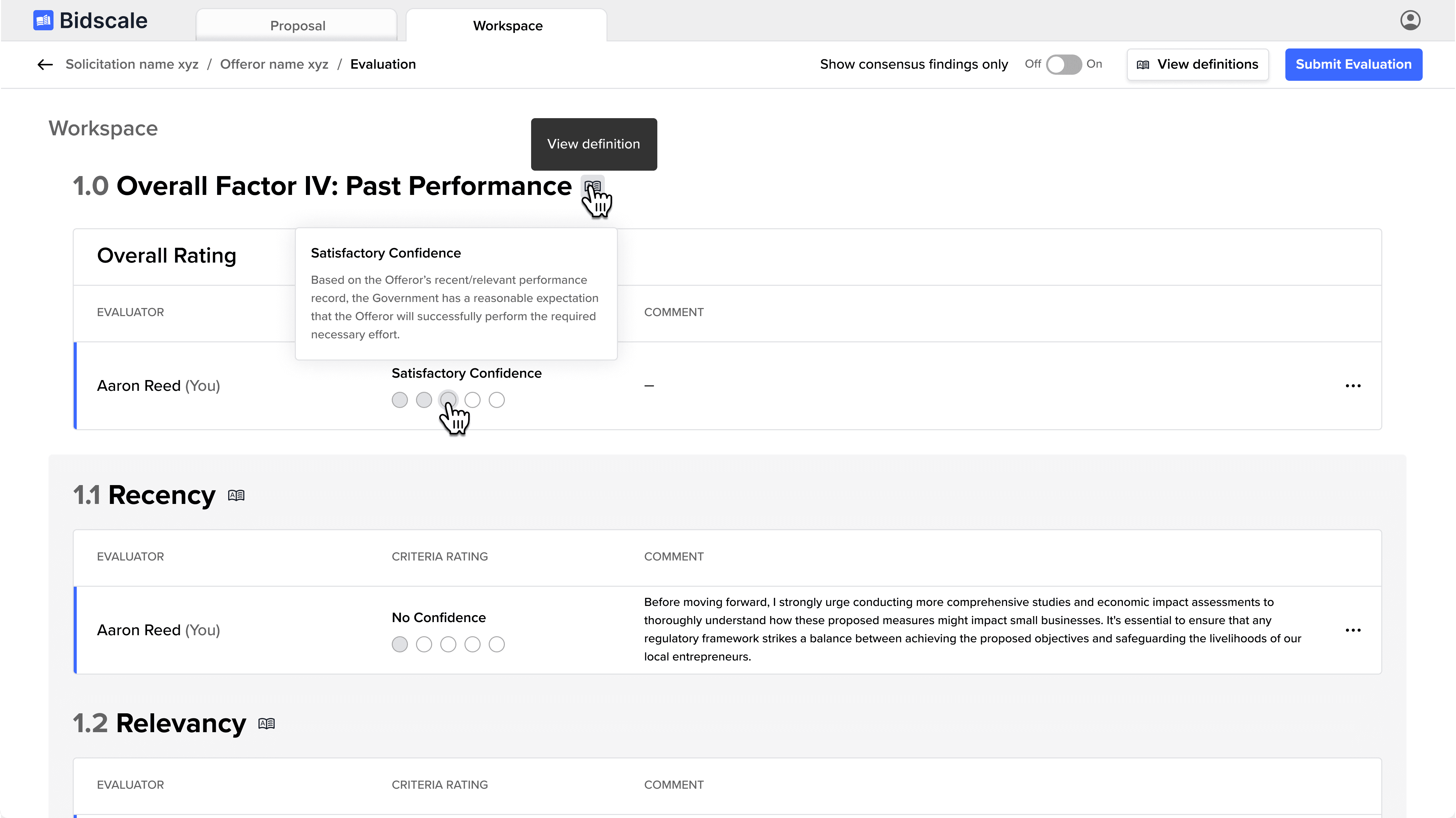
Users frequently referenced definitions for criteria and ratings outside of the tool
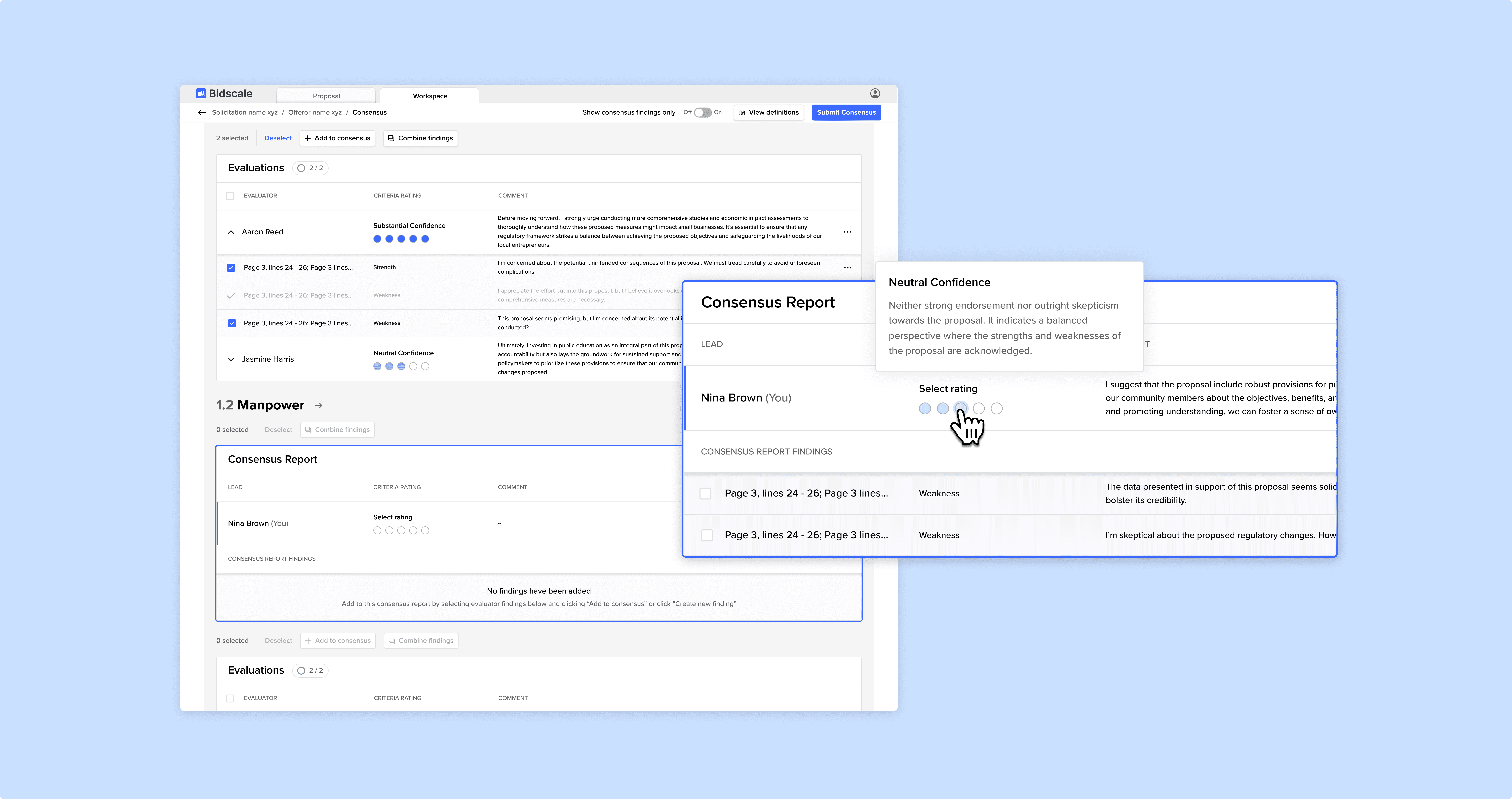
Consensus leads wanted the ability to combine findings from multiple evaluators
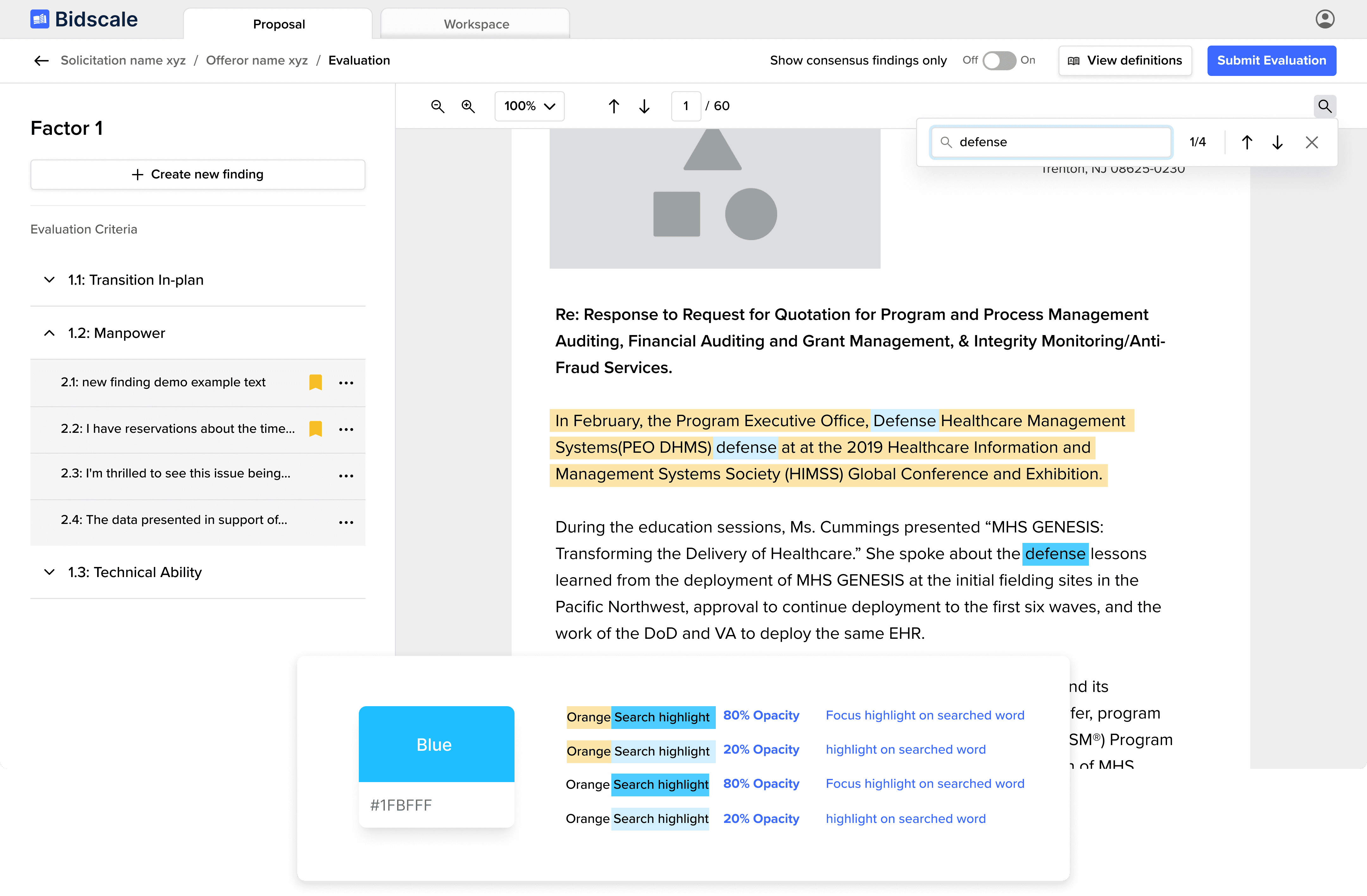
Users wanted to be able to search a proposal for key words
Consensus leads wanted to be able to choose what findings made it to the Consensus Report
The challenge was to address all of the above pain points while also converting all components over to a new design system.
The Approach
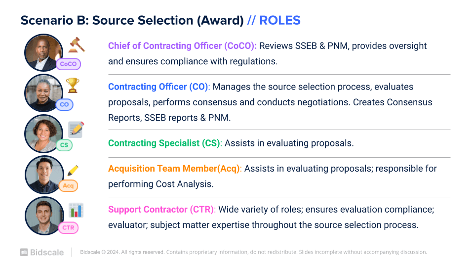
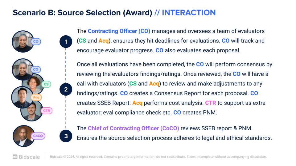
Digital Source Selection is a complicated process that varies based on the government agency. In order to understand how each persona was using source selection, we took the time to define each role's responsibility and the interactions these personas have in and outside of the tool. We created Scenario A: Market Research/Pre-Award; Scenario B: Award; and Scenario C: Post-Award. Below is Scenario B that features Award (Digital Source Selection).
The team reviewed current user pain points and defined common communication patterns. This allowed us to begin confidently suggesting new features for the tool that would streamline communication and save our users time when building reports. We then developed prototypes of these features that were then presented to users and stakeholders for validation.
The Results
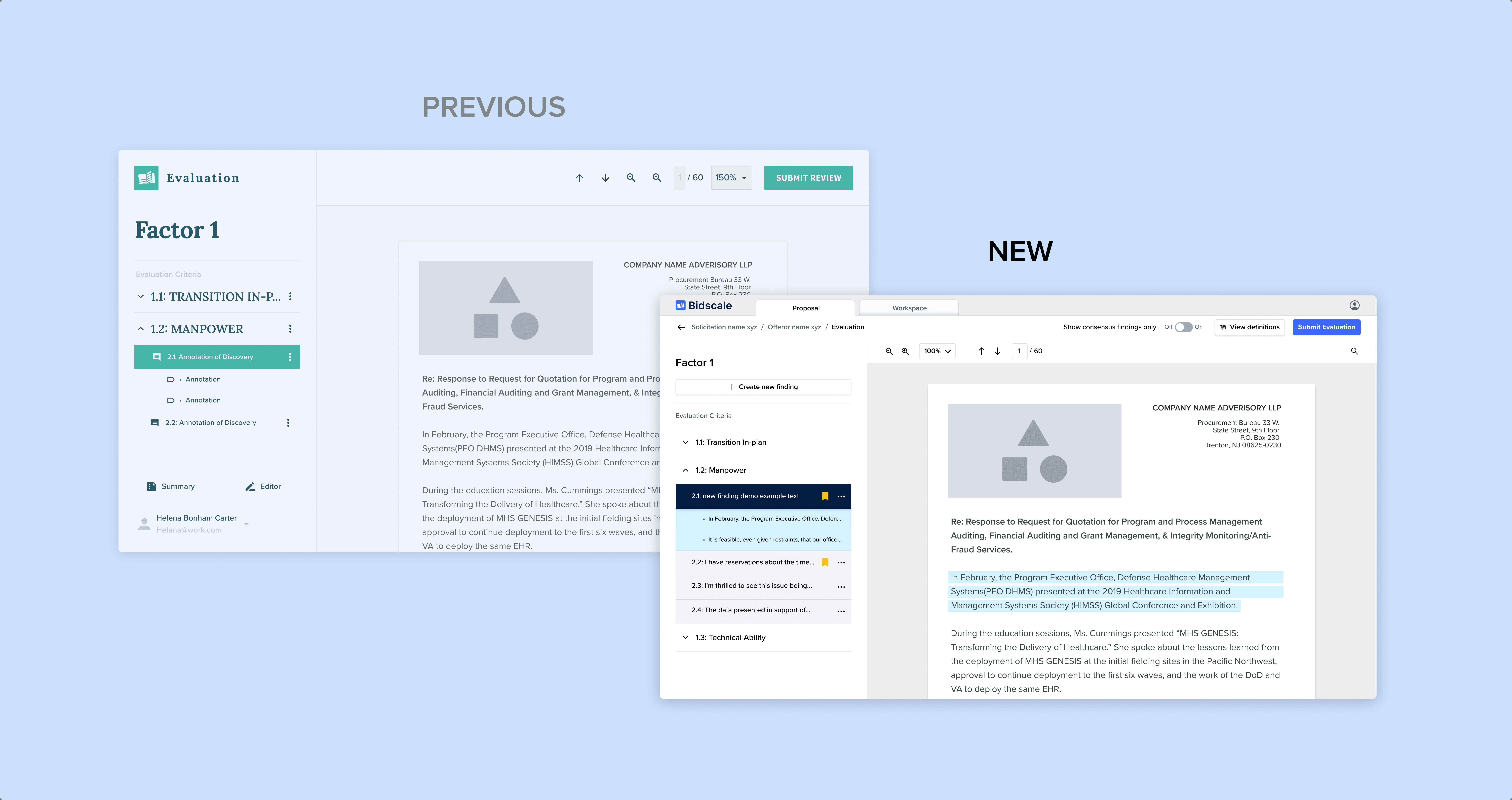
While focusing on improving UX, we also introduced many UI improvements to help the user see all findings. Improvements include the following:
Clear multi-view indicator
Definitions drawer easily accessible via the top bar at all times
New large "create finding" button for general findings
Easy rating selection via button with hover definitions
Search functionality introduced to the document
Clear kebab messaging on all findings
These changes resulted in increased evaluation times and most importantly, quicker consensus reached for consensus leads. Our users have continuously praised the new "Workspace" view that allows a lead to build the Consensus Report directly in our tool. Previously, users had to manually remove findings in the report itself.
